We’re in the final quarter of 2019, and you may already be looking ahead to 2020 and its many exciting projects, trips, collaborations and new initiatives.
It’s also a great time to start thinking about 2020 trends and your creative vision for the new year.
Each fall, the release of Benjamin Moore’s colour of the year selection (and complementary hues) gets me excited and inspired. I just love the colours they’ve chosen this year, and I’m giving you a rundown of the colour trends you can expect to see all over the place in 2020 — including some tips on how to work with them.
Benjamin Moore has released its 2020 Colour of the Year and Colour Trends Palette, and I just love it. 😍 It is SO. ON. POINT.
Benjamin Moore usually gets it right, and this year is no exception. The company “take[s] the temperature of the times and select[s] a single hue from a deck of more than 3,500 that sums up the results” — not an easy task, but one that it excels at.
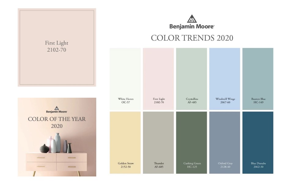
2020’s Colour of the Year is First Light, a rosy pink hue that’s the perfect balance of sophistication and fun. It’s not too sweet and not too pink — it’s a perfect and subtle colour that suggests optimism, joy and the heart-warming, cozy, golden feeling that comes from witnessing the dawn of a new day. 🌸🌅✨
Fight Light is a livable colour — a neutral with more personality than beige or grey. It’s colourful without being overwhelming and provides a pop of fun while staying soft.
Even better, Benjamin Moore’s accompanying 2020 palette of nine other harmonious hues is simply gorgeous. The colours — which include soft pastels and darker, bold colours — combine perfectly to create a chic and modern palette for any home.
“A fresh palette. A revitalized spirit. A soft, rosy hue blooming with potential. Benjamin Moore’s Colour of the Year 2020, First Light 2102-70, is the backdrop for a bright new decade.”
– Benjamin Moore
Love it!
Helen Shaw, Director of Benjamin Moore UK, explains: “Over the last few seasons, we have gradually seen neutrals with pink and red undertones taking over from our traditionally cooler grey neutrals and the selection of First Light as our Colour of the Year takes this evolving trend a step further.
“It’s a soft and dusky rose tone that flatters any space and reflects the desire to use blush tones in grown-up spaces and a desire to introduce more colour overall into our environment.” – via House Beautiful

Andrea Magno, Benjamin Moore Director of Colour Marketing and Development, says First Light represents a new dawn of idealism, design and living. “First Light 2102-70 reflects a new definition of the home – a shift in mindset from the material to satisfying the core needs in life: community, comfort, security, self-expression, authenticity and ultimately, optimism,” she says. – via House Beautiful
How to Work with Benjamin Moore’s 2020 Colour Trends

Embrace the New Neutrals
Neutrals don’t have to be grey or beige — soft hues like First Light are an excellent option.

Anchor Pastels with Bold Colours
Softer colours pair well with more earthy, grounding shades, as found in the palette.

Be Influenced by Nature
From a sunrise to leaves in a forest to a sunny sky, these colour trends are perfectly natural.

Use the Palette as Inspiration
The entire palette of complementary hues works well together — use it as your guide!
The four images above are from Benjamin Moore.
